Display your creative spirit here in the Pink Poogle Toy Gallery. It can be art... it can be music... it can be a poem (even haiku)... but most of it... it must be you.
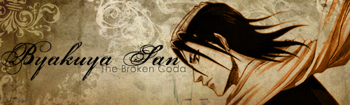
Oooh, I LOVE the background (especially on the header). Very nice layering and quite subtle. Good analogous color scheme. Nicely earthy.
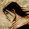
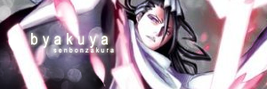
Composition-wise, I think the header is the best because the others have his face right in the center (in the sig) or somewhat a strong line smack in the center (vertically) of the icons. I would suggest playing around with cropping and asymmetrical symmetry. But with the text, it's slightly below centered horizontally, which is good. Also, his scarf is almost going STRAIGHT into the upper right hand corner in the sig...I prefer it if it was hitting the corner asymmetrically (like in the header). Also in your LJ icon, the upper left corner, the space above his head is creating an almost perfect right triangle (as if his head wants to get near the edge but afraid to touch it). You could either create an uneven space by rotating his head a bit or don't be afraid to crop his head a little.
I'm not too fond of the sub-font(?). I would find something without serif (caps on the end of letters) but kinda faded into the background (especially like the one in the avatar), since your main text is already fancy. Taking the serif off may bring a contrast to the fonts more.
Zilary wrote:I hope that helps and wasn't too critical...
No no, that was good! I changed the subtext on the LJ icon and header, but I left the set alone for now. You were right about rotating and cropping--it was getting repetitive and boring to look at him in the same position in all of them.
I would've used the same font on the av/sig for the LJ icon/header, and I wouldn't of capitialized the "S" in "senbonzakura". I'm also not too sure about you straightening the guy (lolz I don't know who he is) on the LJ icon. It would've been better if he was leaned over.
SO MUCH NEW STUFF I THINK MY HEAD IS GOING TO ASPLODE!
First: I re-redid the Byakuya LJ icon. Second: That's a great idea Hikaru, but when I tried pasting the words into Photoshop it didn't show up the way you typed it. Third: Another quartet! This time I did a collage.
Whew...I need to take a break now before getting to work on my student council t-shirt.








 [/url]