A few pictures I drew...:] (new ones added)

Display your creative spirit here in the Pink Poogle Toy Gallery. It can be art... it can be music... it can be a poem (even haiku)... but most of it... it must be you.

Moderator: Moderators

Locked
Message
Author
labbiedor
PPT Trainee
PPT Trainee
Posts: 651
Joined: Sat Sep 03, 2005 8:18 am

A few pictures I drew...:] (new ones added)

#1 Post by labbiedor »

I've been drawing a lot lately, and I thought I'd post a few pictures I've drawn in the past week or so. I know I'm not the best artist, but I'd love to hear any advice you guys might have for me. :) (Sorry if the pictures are bad quality, but I don't have a scanner so I have to take pictures of all of my art...)

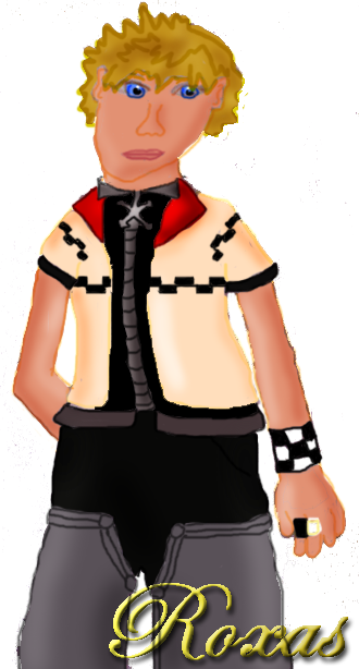
Roxas

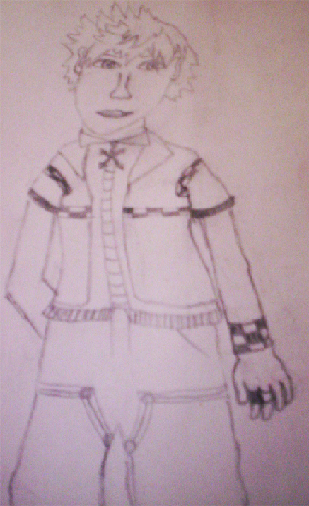
This is a picture I drew of Roxas from KH2. Um...I drew it by hand, and I colored it on the computer, and as you can see I'm not very talented at coloring and shading on Photoshop. I really hate the way his face turned out. It looks all smushed. I think the sketch looks much better - if you want you can click here to see it.

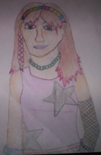
Funky Girl

This picture is just of a random girl, with some funky hair and clothes. As you can see, I'm much better at coloring with colored pencils, and not the computer. :P I really like this picture, I think it's probably the best one I've drawn for a while.

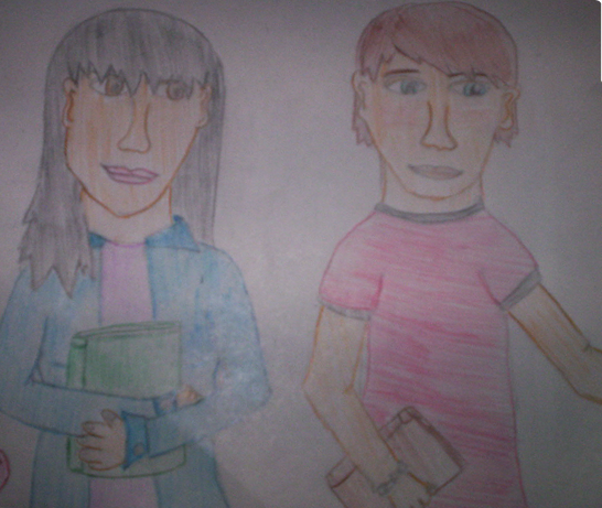
Girl & Boy

The girl has a crush on the boy in the picture...so she's watching him go into his classroom. :P

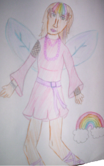
Fairy

Yay, a magical fairy! :D


I'll probably post a few more pictures later...I'd love to hear any comments and advice. :)

Last edited by labbiedor on Thu Jul 27, 2006 3:27 pm, edited 1 time in total.
Image
<3
fructy
PPT Student
PPT Student
Posts: 330
Joined: Thu Sep 29, 2005 8:53 am

#2 Post by fructy »

The drawings are pretty good, but I do have some pointers.
First drawing: You did a good job on the shading and colouring! The only critique I have is that his head has a wierd shape and the autonomy of his head isn't right. (for instance, his ears are too hight. The botten of his ears should be at the same line/height as the bottom of his nose and the top of his ears should be at the same line/height as his eyes.)
The same thing goes for you second drawing.

The autonomy thing is very easy to learn in time though. You definitly have talent! :)
labbiedor
PPT Trainee
PPT Trainee
Posts: 651
Joined: Sat Sep 03, 2005 8:18 am

#3 Post by labbiedor »

fructy wrote:The drawings are pretty good, but I do have some pointers.
First drawing: You did a good job on the shading and colouring! The only critique I have is that his head has a wierd shape and the autonomy of his head isn't right. (for instance, his ears are too hight. The botten of his ears should be at the same line/height as the bottom of his nose and the top of his ears should be at the same line/height as his eyes.)
The same thing goes for you second drawing.

The autonomy thing is very easy to learn in time though. You definitly have talent! :)


Thanks a lot! I see what you mean about the ears. I'll definitely try to work on that the next time I draw. :) I think I'm so used to drawing with the ears up so high because I thought my art teacher last year told us that the top of the earlobe should be at the eyebrows, but I think I might of heard her wrong.
Image
<3
Igg
Honorary Member
Honorary Member
Posts: 6288
Joined: Fri Jun 04, 2004 5:47 pm

#4 Post by Igg »

The top of my ears are about level with my eyes. :)
Image
Image
Blonde Fizz
Newbie
Newbie
Posts: 1
Joined: Fri Jul 28, 2006 6:38 pm
Location: On my smurf

#5 Post by Blonde Fizz »

Anatomy is a hard thing. I suggest drawing from a picture and practicing the basic placement. With practice I think you be very good. I myself am well I think 'm bad, but I've been told otherwise (I think they lie!) And it's taken me 5 or 6 years (wow it's been that long) to be where I am today. But yes you have marvelous potenial.
Zero!
Beyond Godly
Beyond Godly
Posts: 3007
Joined: Tue Jun 01, 2004 5:08 pm
Location: You're FACE.
Contact:

#6 Post by Zero! »

http://i18.photobucket.com/albums/b140/ ... biedor.gif

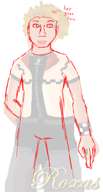
Here is a redline (basically, drawing over another drawing to show the anatomy flaws).
Obviously, the face is very oddly shaped, but that was mentioned already so nyeh. It was also too big for the shoulders. The shoulders themselves were too curvy - it's almost as if they weren't there. Also, arms are not just long tubes when stretched out - they curve in a bit when they reach the elbow, and the forearm curves out a bit more at the beginning of it. The fingers were also too short and stubby. His body looked lopsided as well.
As for the coloring, there are lots of colorbleeds. Do you use layers? If not, practice using them, because it is a LOT easier, trust me. Basically, do your lines on one layer, make a new layer underneath, and color there so that your lineart remains intact. As for the lineart that is visible, I would either make your hand steadier, or learn to use the pen tool (I'm sure there are tutorials somewhere, since I cannot explain it at all). They are very shaky and wobbly. The shading is also odd - there is no definate lightsource. Basically, picture light coming from somewhere and hitting Roxas, and try to shade according to that. Like, if light was coming from the left side, there would not be highlights on the right side of his right arm, and etc.

I won't critique the other pictures since the things I said here can be applied to those as well.
I know I said a lot of things, and I know that it will come off as harsh (since I don't really like to sugarcoat things), and I am sorry. Try not to take it personally. It's a LOT of things to fix, but I know that you can fix 'em and make your art look a lot better C:
Image
Zero set 13 of 26
labbiedor
PPT Trainee
PPT Trainee
Posts: 651
Joined: Sat Sep 03, 2005 8:18 am

#7 Post by labbiedor »

Sunnie wrote:http://i18.photobucket.com/albums/b140/ ... biedor.gif

Here is a redline (basically, drawing over another drawing to show the anatomy flaws).
Obviously, the face is very oddly shaped, but that was mentioned already so nyeh. It was also too big for the shoulders. The shoulders themselves were too curvy - it's almost as if they weren't there. Also, arms are not just long tubes when stretched out - they curve in a bit when they reach the elbow, and the forearm curves out a bit more at the beginning of it. The fingers were also too short and stubby. His body looked lopsided as well.
As for the coloring, there are lots of colorbleeds. Do you use layers? If not, practice using them, because it is a LOT easier, trust me. Basically, do your lines on one layer, make a new layer underneath, and color there so that your lineart remains intact. As for the lineart that is visible, I would either make your hand steadier, or learn to use the pen tool (I'm sure there are tutorials somewhere, since I cannot explain it at all). They are very shaky and wobbly. The shading is also odd - there is no definate lightsource. Basically, picture light coming from somewhere and hitting Roxas, and try to shade according to that. Like, if light was coming from the left side, there would not be highlights on the right side of his right arm, and etc.

I won't critique the other pictures since the things I said here can be applied to those as well.
I know I said a lot of things, and I know that it will come off as harsh (since I don't really like to sugarcoat things), and I am sorry. Try not to take it personally. It's a LOT of things to fix, but I know that you can fix 'em and make your art look a lot better C:


Wow, thanks a lot for all of the help. I do have a very shaky hand (that's why the picture of Roxas turned out kind of lopsided and my lines aren't straight), but I'll definitely try to work on that. Thanks for taking the time to make the outline for the anatomy, I appreciate it and I think it'll help me with my art the next time I draw. :)

Blonde Fizz wrote:Anatomy is a hard thing. I suggest drawing from a picture and practicing the basic placement. With practice I think you be very good. I myself am well I think 'm bad, but I've been told otherwise (I think they lie!) And it's taken me 5 or 6 years (wow it's been that long) to be where I am today. But yes you have marvelous potenial.


Thanks a lot! :) I'll try to practice more often with my art. I think in a few years of practice, once I'm older (I'm only 13) my art will be a lot better than it is now.
Image
<3
starryeyed_surprise
Newbie
Newbie
Posts: 17
Joined: Wed Jul 12, 2006 7:57 pm
Contact:

#8 Post by starryeyed_surprise »

i think its really good,better than wat i can draw!i agree with wat sunnie said & i think u will bcome a better drawer(however u spell it) in time!well good luck!
~For every dream that shatters,another one comes ture~
Locked